

Question Types Reference
This is the reference for every question type available in the SmartForms V2 toolbox. For each type: what it is, when to use it, what the patient sees, and the configurable options.
For the workflow of building a form, see Creating A Smart Form.
Single-Line Input
What it is. A one-line text field.
Use it for. Names, email addresses, dates of birth, postal codes, phone numbers, any short free-text answer.
What the patient sees. A single-line text box.
Configurable options.
- Title is the question text, shown in bold above the box.
- Description is optional helper text under the title.
- Required stops the patient from submitting the form until they answer.
- Input Type chooses between Text, Number, Email, Tel (phone), Date, Date and Time, Time and others. The patient’s browser shows the input control that suits the type.
Long Text
What it is. A multi-line text area.
Use it for. Open questions where the patient may need several sentences, such as the chief complaint, the history of the present illness, allergy details or dietary notes.
What the patient sees. A larger multi-line text box they can resize.
Configurable options.
- Title, Description, Required (same as Single-Line Input).
- Rows sets how many lines of the text area show at first.
Radio Button Group
What it is. A list of choices where the patient picks one.
Use it for. Questions with one answer, such as sex assigned at birth, a single best answer, or agreement with a single statement.
What the patient sees. A list of round radio buttons with the choice labels next to them.
Configurable options.
- Title, Description, Required.
- Choices is the list of options. You edit them in the Choice Options tab.
- Display the question on a new line puts the question on its own row when it is on. When it is off, the question can sit beside another question.
- Column count sets how many columns of choices the patient sees. More columns suit very short choices, such as Yes, No and Maybe.
Checkboxes
What it is. A list of choices where the patient can pick more than one.
Use it for. Symptoms list, medication classes the patient has tried, services they’re interested in, any “select all that apply” question.
What the patient sees. A list of square checkboxes with the choice labels next to them.
Configurable options. The options are the same as for Radio Button Group. Choice Options holds the list, and the layout settings control the column count and whether the question starts on a new line.
Dropdown
What it is. A list of choices in a closed dropdown. The patient picks one.
Use it for. Long lists where a Radio Button Group would take too much space, such as country, province, allergy type or preferred language.
What the patient sees. A single dropdown. Clicking it shows the choices.
Configurable options.
- Title, Description, Required, Choices.
- Placeholder is the grey hint that shows in the dropdown before the patient picks anything. It reads Select… unless you change it.
Multi-Select Dropdown
What it is. A dropdown where the patient can pick multiple options.
Use it for. Long “select all that apply” lists where a Checkboxes list would be too tall, such as languages spoken or allergies.
What the patient sees. A dropdown that shows their selected choices as tags. They can click the X on each tag to remove it.
Configurable options. Same as Dropdown.
Yes/No (Boolean)
What it is. A two-position toggle for a Yes/No answer.
Use it for. Clinical questions with a yes or no answer, such as Have you ever smoked? or Are you currently pregnant?
What the patient sees. A toggle-style control with No on the left and Yes on the right. The active choice is highlighted.
Configurable options.
- Title, Description, Required.
The labels Yes and No are fixed and cannot be changed.
Ranking
What it is. A list of items the patient drags into their preferred order.
Use it for. Priority questions, such as Rank these goals for the treatment plan from most important to least. For a clinical assessment, a free text question usually suits better.
What the patient sees. A vertical list with drag handles. They reorder by dragging.
Configurable options. The options are the same as for Radio Button Group. Choices holds the list.
Image
What it is. An image shown on the form. It is not a question, and the patient does not answer it.
Use it for. A visual diagram on a body-map question, an example signature, a logo for a printable section, or any reference imagery you want the patient to see before answering nearby questions.
What the patient sees. The image as you’ve sized it. No input.
Configurable options. Image URL, image height and width.
Slider
What it is. A horizontal slider the patient drags to pick a numeric value in a range.
Use it for. Pain scales from 0 to 10, symptom intensity and satisfaction ratings.
What the patient sees. A horizontal track with a handle to drag. The value under the handle shows in a small tooltip.
Configurable options. Min value, Max value, Step value, and whether the scale labels and tooltips show.
Text block
What it is. Text on the form that is not a question. Nothing for the patient to answer.
Use it for. Instructions, a heading between sections, a note explaining why you are asking something, or your own consent or policy wording.
What the patient sees. The text, formatted as you wrote it, sitting between the questions.
Configurable options.
- The text itself, which you type on the form or in the property panel.
- Basic formatting: bold, italic, underline, and bulleted or numbered lists.
Nothing is recorded against a Text block, so it never appears in a submission. This is what makes it the right choice for instructions. A question used as a heading shows as an empty row in every submission you receive.
Signature
What it is. A signature pad the patient draws their signature in with mouse, finger, or stylus.
Use it for. Consent forms, treatment agreements, anywhere a real signature matters.
What the patient sees. A box labelled Sign here with a clear button. Their signature draws as a stroke as they sign. On mobile, they sign with their finger.
Configurable options.
- Title, Description, Required.
- Height of the signature pad.
The signature is saved with the submission and shows on the practitioner’s view as the signed image.
Single-Select Matrix
What it is. A grid where each row is a question and the columns are the same set of choices. The patient picks one column per row.
Use it for. Rating several statements on the same scale, such as Rate each of these symptoms: Mild, Moderate, Severe or N/A.
What the patient sees. A table. Each row is a question, the column headers are the choices, each row has one selected button.
Configurable options.
- Title, Description, Required.
- Rows is the list of statements, one question per row.
- Columns is the list of choices that every row shares.
Multi-Select Matrix
What it is. A grid where each row is a question and each column is its own input type (checkbox, dropdown, text, comment, etc.).
Use it for. A grid of related questions, such as For each medication: dose, frequency and prescriber.
What the patient sees. A table. Each row is a question, each column is its own input the patient fills in.
Configurable options.
- Rows is the list of items.
- Columns each have their own input type and their own settings, such as the choices for a dropdown column.
Dynamic Matrix
What it is. A Multi-Select Matrix where the patient can add rows themselves. The table starts empty or with a few rows, and the patient adds more as needed.
Use it for. Lists of unknown length, such as current medications, past surgeries, regular supplements or family medical history.
What the patient sees. A table with an Add Row button below it. Each row is a compound question (same as Multi-Select Matrix). They add rows for as many entries as they need.
Configurable options. Columns (as Multi-Select Matrix), plus minimum and starting row count.
Multiple Textboxes
What it is. A group of small labelled text inputs in one question.
Use it for. A set of short related fields that belong together, such as Pharmacy: name, phone and address.
What the patient sees. A compact set of small text boxes, each with its own label.
Configurable options.
- Items is the list of small fields, each with its own label and input type.
Panel
What it is. A grouping container that holds other questions inside a labelled box.
Use it for. Grouping related questions into a section, such as Insurance Information with the insurance fields inside, or Emergency Contact with the contact fields inside.
What the patient sees. A bordered box with a section title at the top and the contained questions inside it.
Configurable options.
- Title is the section heading.
- Description is text under the title.
- You drag questions into the panel from the toolbox or from elsewhere in the form.
Dynamic Panel
What it is. A panel that the patient can repeat. The form starts with one copy, and the patient adds more.
Use it for. Repeating groups of questions of unknown count, such as one group for each child with the child’s name, date of birth and allergies, or one group for each insurance policy.
What the patient sees. A panel with an Add new button below it. Clicking adds another copy of the same panel for them to fill.
Configurable options. Same as Panel, plus minimum and starting panel count.
Ready-made items in the toolbox
Besides the question types above, the toolbox has three groups of ready-made items:
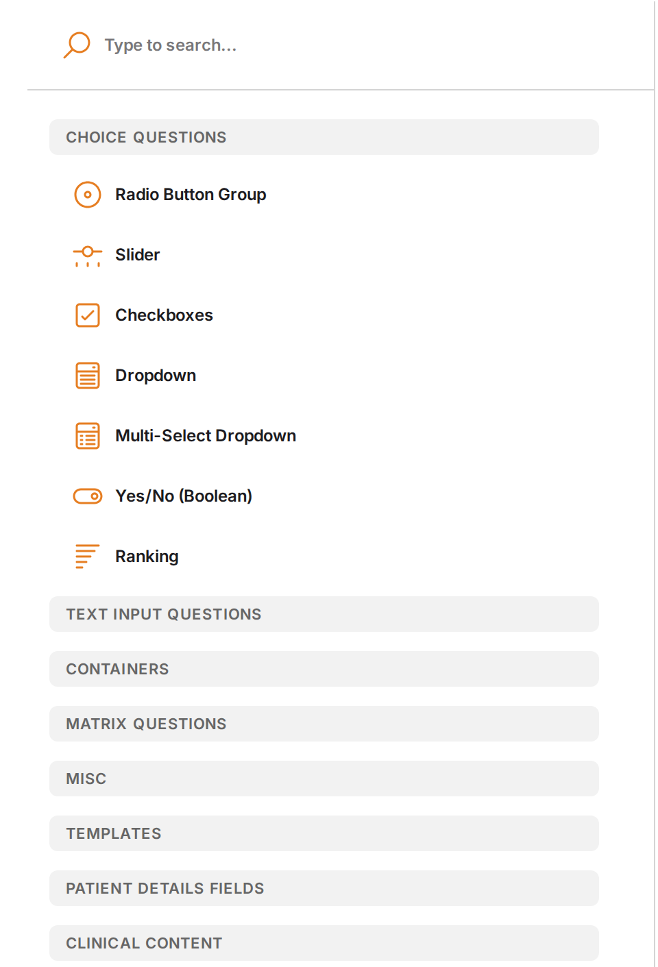
The toolbox categories. The ready-made items are under Templates, Patient Details Fields and Clinical Content.
- Templates holds blank shapes to start from, such as Patient details and Multi-select with describe.
- Clinical content holds full question sets: the Medical History conditions, the Review of Systems and the Orthotics conditions.
- Patient details fields holds the single questions from the Patient details template, such as the patient’s address or phone number, so you can add only the ones you need.
The Form Editor and Asking Patients For Their Details In A Smart Form explain these items.
Related Pages
- Creating A Smart Form explains how to drag these question types into a form and set them up.
- Patients Filling Out A Smart Form explains what the form looks like to the patient.
- Viewing Smart Form Submissions explains how each answer shows in the answer view and the PDF.